Why White Space Is Important
Have you heard of the term "white space" in graphic design? What makes this so important and why is it essential in design?
White space refers to the space left in between elements of your design. It is also often referred to as negative space, but don’t let the name worry you – it’s a good thing! It is essential for a balanced and harmonious layout and without it your design would look cluttered and overcrowded. While the term used is white space, it does not necessarily mean it is white. The space may be any color or texture that represents the negative space in your design.
There are two types of white space. Active white space is the space left blank intentionally for better layout or structure. Passive white space is the empty space around the outside of the page or blank areas inside the content which is the by-product of the layout process.
White space is a fundamental building block of good design for good reason. Not to be thought of as a waste of space, it can be strategically used in design to transform and highlight design elements and key messages.
“White Space in design composition is same as use of Silence in a musical composition. Without proportionate use of Silence, music is unstructured; some may call it noise. Similarly, without White Space, design is unstructured and difficult to consume."
Let’s take a closer look at some of the benefits of whitespace in your design:
Improves readability and comprehension.
When text and images on the page are cluttered and overcrowded, it can make your design quite difficult to read and comprehend. Adding white space allows the reader or viewer to focus on the key message or design in front of them. This applies to both text and design elements. White space allows the reader to easily read and understand what they are viewing.
Highlights a key message or design element.
White space is a creative and powerful way of drawing the reader or viewer to a particular element of the design. It is also a powerful way to create a certain mood or look in a design piece. It can create focus and highlight design elements by offering visual cues to which elements belong together and which are separate.
Increases visual appeal.
White space in design creates focus, balance and reinforces quality and professionalism. It is visually appealing and creates a clean, relaxing visual effect. White space is key to get the message through.
So the general rule of thumb - less is more. Don’t overcrowd your design in an attempt to push your marketing message through. Strategic and thoughtful use of white space is important and will offer a more professional representation of your brand.
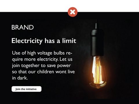
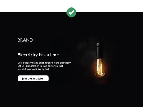
Here are some samples of the good use of white space. Click on any image to view the slideshow.